I wasn't that fussed on the Traveler stamp set in the new catalogue but when I saw it stamped I was impressed with the sharpness of the lines and I think it will be a great stamp for monochrome cards. It is especially useful for male cards I think.
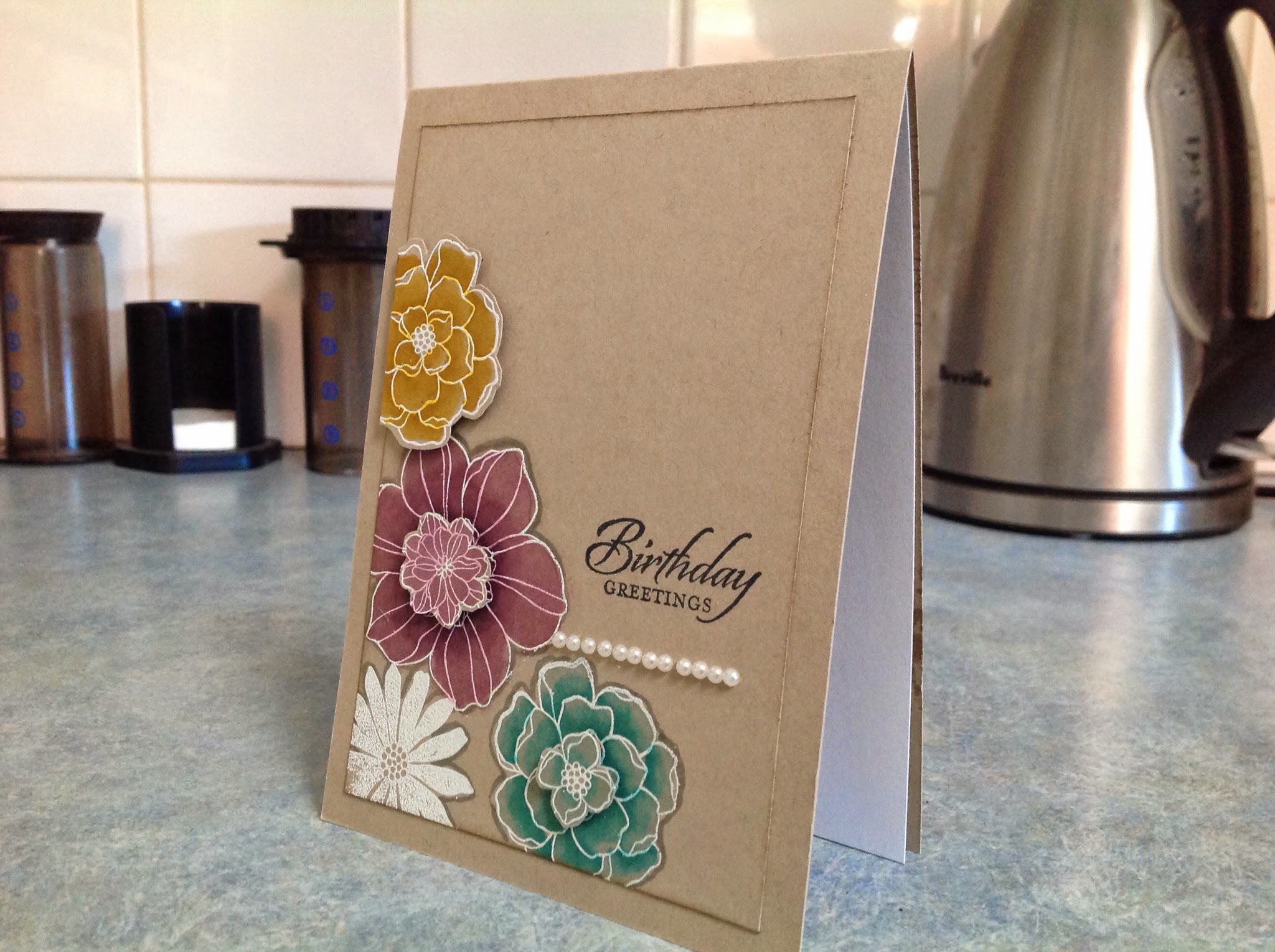
The card base in this first one is Very Vanilla. I stamped the images in Early Expresso ink and trimmed them to 4.5cm square and matted each in Early Expresso. The matts need to be quite narrow to fit across a standard size card front. The bottom section is Very Vanilla cardstock run through the Perfect Polka Dots embossing folder and brayered in Early Expresso on the wrong side ( de bossed side). Bakers twine and a sentiment cut with the narrow oval punch completes the card.
I used the digital version of the
Little Moments project life cards for the star background DSP. The ship image was inked in Baked Brown Sugar. The frame was made in the same colour using the Squares Collection framelits. ( you cut 2 sizes of the dies one inside the other) the new thick Baked Brown Sugar Bakers Twine completes the card.
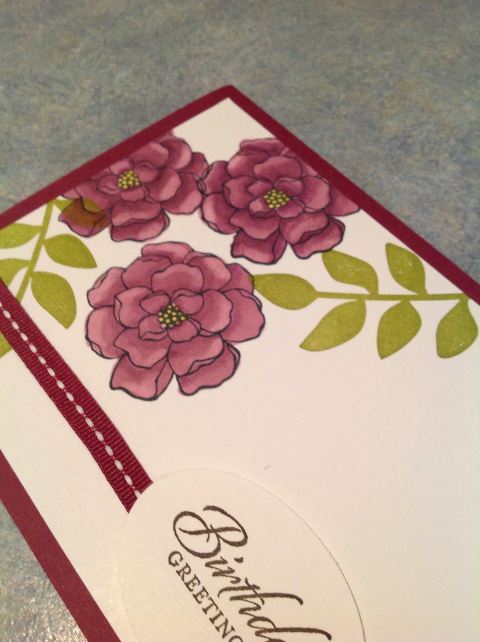
Very simple but effective. Again Early Expresso is the colour of choice. The dotted strip is Very Vanilla cardstock embossed with Perfect Polka Dots and brayered in ink on the reverse de-bossed side. The orange is the new Tangelo Twist.
This card was cased from
Pat Meyer
http://patstamper.typepad.com/my_weblog/2014/06/new-stamp-set-traveler.html
http://patstamper.typepad.com/my_weblog/2014/06/new-stamp-set-traveler.html
It is another technique that could be used on any similar lined stamp. You simply stamp the image then using the BigShot and die 1,3 and 5 of the Squares collection framelits you cut the image into 3 squares. Then you sponge around each using Smokey Slate and assemble on the Smokey Slate card base. The strip at the bottom was cut using the Dotted Scallop border punch and the sentiment was printed digitally with My Digital Studio. Check out the how to video at Pat's webpage.
Love how this background DSP looks. I printed it from the Everyday Adventure Project life cards on My Digital Studio. Before printing it I added the sentiment. The train was stamped in Early Expresso and cut out with the 2.5 inch round punch and the Matt was cut using a Circles Collection Framelit. I cut a narrow contrast strip to balance the bottom of the card.
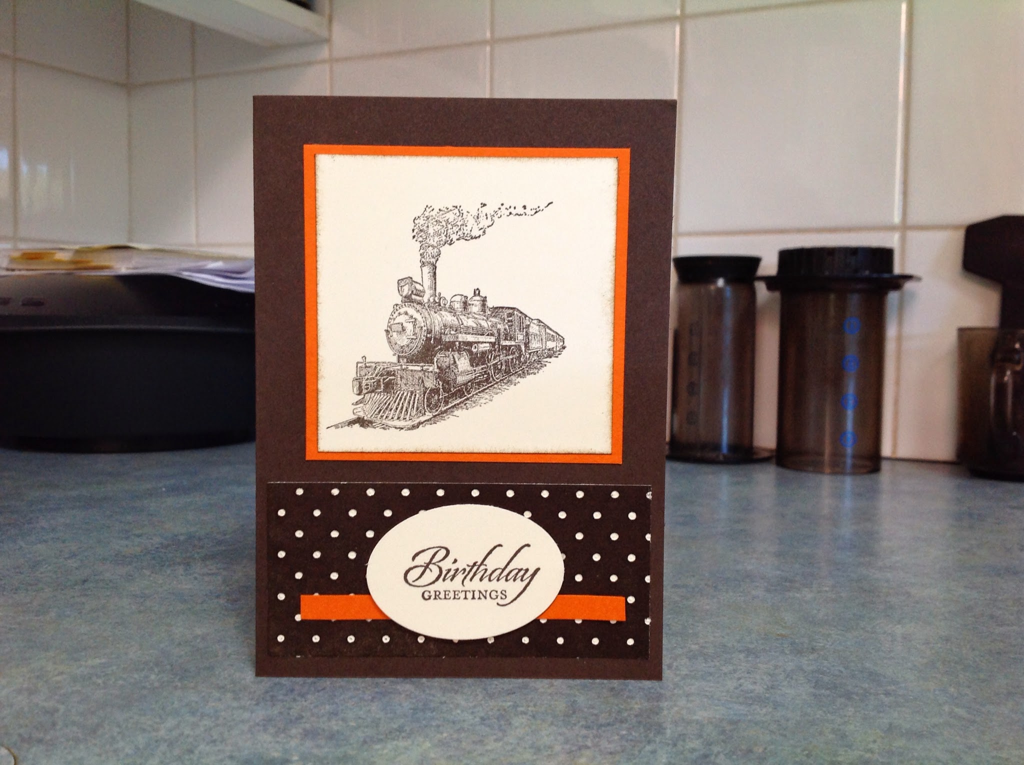
The Traveler stamp set is perfect for retirement cards. I simply stamped the images in the new black Memento permament ink and then using the Square punch cut them out and matted them all on the one piece of blac card. The card base is the new Hello Honey. This colour teams very well with black.
Hello Honey cardstock again this time teamed with Early Expresso ink. The background to the ship is the ledger stamp from Open Sea. I stamped it in Crumb Cake which had been stamped off once. ( stamp it first on a scrap piece of paper to lighten the colour)
Lost Lagoon, another new colour was used for this card. The Matt is the same colour embossed with Stylish Stripes and then brayered with the same colour on the back. Love this technique and it saves on buying DSP!
The technique is a variation on the Pat Meyers card. I matted each part in Smokey Slate. ( ok, the truth is I misread her instructions the first time around and didn't want to waste it!)
After my less than enthusiastic start with this set I am now able to think of all sorts of ways this can be used. It could be coloured with the new pens, it could be embossed over a brayered sunset background.........
Must stop and play with something else. Only 4 weeks until my next workshop and I want to have lost of samples done of the new things I have bought.